The British Museum concept
Overview
A two-week design sprint focussed on the problem of accessing museums and galleries during lockdown, and if such a solution could be rolled out to users more generally as a compelling offering in its own right.
This case study was also featured in the UX Collective’s BOOTCAMP publication.
The brief:
Ability to browse and book tours virtually, as a way of overcoming lockdown restrictions
The tour experience should be in-app
Needs to have some form of user interaction between guide and participants
The outcome:
A clickable, high-fidelity prototype that allows teachers to provide virtual guided tours to groups of students
Narrative focussed design, encouraging maximum levels of user engagement
Key findings:
With such an open-ended brief, design studios were of key importance in order to make really explore the multiple possible solutions
Additionally, because solutions were potentially so numerous, feature prioritization became an essential tool in order to create a Minimum Viable Product within the short deadline
The Project
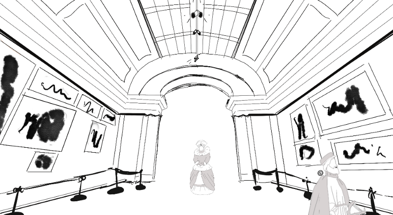
The British Museum, in the Bloomsbury area of London, is a public institution dedicated to human history, art and culture. Established in 1753, it was the first public national museum in the world. Inspired by recent events around social isolation and the impact on tourism, they want to begin offering virtual tours and talks directly from the museum.
Although there are several key points in the brief to focus on, there was also a large degree of freedom afforded in how we might approach the challenge. However, the nature of the app’s motivation was also a blocker for us — it would not be possible to conduct any field studies of users in a museum environment. Instead, we began by conducting interviews. Lots and lots of interviews.
Defining the user
“In the right context, an app allowing virtual access to culturally enriching locations such as museums could open a lot of doors for students”
On top of many interviews, we also had access to plenty of other cultural demographic research from both arts consultancies and the UK government’s own heritage statistics, as well some supplementary findings from our own survey.
After a long process of synthesising our findings, some common user elements emerged. These included:
60% of the museum’s visitors were young learners who also want to be active, social and connected
Teachers and school groups represented the highest amount of returning visitors
Across all demographics, learning is the most consistent motivation to visit
The idea of education and teachers kept re-emerging. It was at this stage we decided to narrow our focus and conduct further interviews with school teachers only.
Leaning into the education aspect, we determined that creating an app for teachers, who could act as a virtual tour guide to their students, would be a valuable angle. This more focused scale also leaves room for rolling out the app to the general public if were successfully received.
Distilling our findings, we created two personas representing our two key users — the teacher and the student.
Teacher persona example:

Making the experience compatible with, and relevant to, the school syllabus is important for the teacher
Competitor research
Then there was the competitor research — who else was offering virtual tours, and how were they doing it? The answer (repeatedly) was Google.
Most museums and galleries opted to use Google’s Street View extension, and offered virtual tours through their properties that way. There was very little in the way of specialist, proprietary tour apps on offer — and those that were tended not to be as well reviewed as Google Arts on the app store anyway.

Finding patterns in what the competitors do (and don’t) offer
So, how might we:
Make the experience compatible with the school syllabus for the teacher?
Make the experience authentic, user-friendly and engaging for the students?
Implement a fun, social, and narrative experience for everyone (as defined by the client)?
Ideation
We began to sketch out some ideas, and again a few commonalities appeared in our designs.

Sketching out some 30-second ideas
A narrative or interactive element to supplement a physical tour guide
Grouping things thematically (rather than say chronologically, or by room)
The idea of exploration
Laying these ideas out we saw that there were a lot of conceptual parts in the process, but we obviously needed the app to be simple and intuitive. We plotted our ideas onto a feature priority chart, and ordered the key elements into a basic user flow.

Although the app had the potential to be very “deep”, we needed teachers — who, we note in our findings, are already time poor — to be able to click through the body of the sequence in as efficient a manner as possible.
Testing and iterating
We began putting some sketches together on how we thought we could best lay it out on screen. These basic wireframes were stitched together in Marvel as a clickable prototype in order to test out the usability of the app.

An initial sketch of the tour curation page. Users got the hang of it once we provided context, but the page was too abstract at first glance.
Although it seemed that without prior context some aspects of the app were difficult to understand, overall the initial feedback was largely positive. The ideas and basic layout seemed to match with user’s mental models, despite the app’s somewhat uncommon presentation.

The layout for the tour itself, allowing users to interact with historical figures on their way through the museum
Lo/mid-fi
The wireframes affirmed that we generally had a clear ‘beginning to end’ user journey overall, though some branching paths (such as the managing the student and games “rooms”) were still somewhat unclear.
This was confounded by issues surrounding the quality and interpretation of icons, as well as a lack of instructional copy — both things that could be easily rectified.
Hi-fi
Simply adding things such as page header titles went a long way in helping the tested user’s navigate through the application and understand functionalities.

Assisting user’s navigation with clearer signposting and iconography
The British Museum has a simple and clear, monotone identity that allows the colours and shapes of the historic objects they curate to stand out.
We opted to add one additional accent colour (a ceramic tone bringing to mind some kind of aged pottery to suit the context) in order to give the app a slight ‘pop’ and ensure that it is kept visually appealing, as well as allow a visual hierarchy to be more easily maintained with object such as buttons.

A section of the final prototype’s home screen
The Prototype
If you wish to have a play around for yourself, the high fidelity prototype can be clicked though here on InVision.
Testing this version led to extremely favourable feedback, with some users saying that “it looks like a real app” and that they “love the design”. Though there were still a few issues around the clarity of the app’s different functionalities, which is the area we would focus on going forward.
Final Design, Takeaways & Improvements
Our “How might we…” brainstormed solutions were met by:
Creating an experience that is compatible with the school syllabus
Creating an experience that is authentic, user friendly and engaging
Implementing a fun, social, and narrative experience

A sample of our hi-fi screens, showing the large amount of app content involved
But of course, there is always room for further iterations and improvements. Findings indicated that we could:
Use more onboarding to dispel confusion (tour pages — timeline)
Develop the game design!
Implement more non-digital games throughout the tour experience section (improv and re-enactment)
Conclusion
We met the brief by creating an app for the largest portion of museum attendees and potential users, and an experience that could outlast lockdown. The feedback we received indicated that the experience was a positive one and that going forwards, such an application could certainly be rolled out to the wider public more permanently.